Monday, December 20, 2021

Chappy ‘n Chappy (WIP) Update 6

 Almost there! Arms and cape attached, bases based.  Left to do is matte seal, highlight metallic areas, the OSL effect for the plasma pistol, and a bit of ‘ard coat to shine up the lenses and jewels.

But the weather outside is frightful, erm a bit too cold to spray the sealer so might have to wait a bit.

Friday, December 17, 2021

Pewter is Hard (to pin)

 I love my retro 40k army, an army that I mostly collected ~25 years ago but only was able to paint to my standards in recent years.  I love the classic beakie armor and the bit of wimsy some of the sculpts bring to the grimdark.  I love the Rogue Trader era.  I love that almost every model in my army is entirely or largely metal, and I got them back when they still made them that way.  I like the heft, they feel sturdy.  (They say that people tend to associate weight with value.)

I HATE trying to drill into pewter though.  Its super hard and takes forever.  I was dreading it and dreading it, and sure enough, it was a pain.

I got through it, but not without problems.

This is another drill bit that was ruined.  The other end is still stuck in Chappy's armpit, probably to remain there for a long, long time.  To be honest, these drill bits have always had problems (maybe they were made for wood or plastic?)  And they also seem too long for their diameter.  I'd really like to improve this skill and gain the right info/tools, especially since I have a bunch of classic Grey Knight Terminators with a bunch of tiny metal weapons/arms to assemble.  I think the bit was only 0.5 or 0.6mm.

So anyway, the hole I was drilling probably didnt need to be so deep, and even after I broke off the drill bit, there was still some hole depth that I could use to pin the arm with.  I do worry that it is much weaker now, but not sure how to fix it.

Then on the other side I went with a bit that was much larger, and that came with the Army Painter kit that the pins came from.  Seems at the larger diameter it would be less likely to break, and I was also hoping that maybe also it was for sure designed to be able to drill metal miniatures.  I think I went with the 1.2mm bit.  Anyway, it worked, but it seemed like I was drilling a crater by comparison.  And it was really, really, really hard.  Pewter is hard, and I was trying to be as gentle as possible to be careful with the paint etc.   The real lesson is to drill everything before painting.  I guess that didn't occur to me because I wanted to paint disassembled, but of course I could have at least drilled and maybe even prepped and saved off the pin somewhere to glue later.  Welp thats why I'm here right?  Write down these lessons so that I do it right next time.


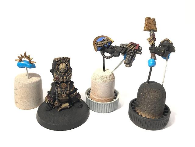
Anyway, Chappy here is almost done, and since he is all about reciting litanies of hate, it seems appropriate that I recited some too while putting him together, ha!

Thursday, December 16, 2021

Color Tone Study

 As I mentioned in the last Chappy 'n Cappy update, I realized that I had used cool tones Dark Reaper and Vallejo Gray Blue for the armor edge highlights.  The recipe I blindly followed was Giovanni Di Lena's presumably famous guide for black power armor.  It was funny because in the back of my mind I was thinking I was supposed to use a modified formula, but I thought I had already modified it in my plan.

Turned out I hadn't.  So when I got looking at my miniature, it looked off.  From Jeremie Teboul's book I knew exactly the problem - color tones.  At first I thought that maybe the cool tones of the armor and the warmer tones of everything else would be an ok effect to emphasize the difference between materials.

But, it kept bugging me.  It looked off and it kept me up at night.  So finally I decided I'd do something, but I didn't want to redo the most difficult edge highlighting stages, so I wanted to try contrast paint.  On a hidden area where the arms are to connect, I tried several colors to try and tint the existing highlights.  Boy did that not work!  I mean, if I wanted a sickly green effect, or muddy rust effect then it would have been great, but none of the tinting effects were anywhere near the look I was trying to achieve.

So rather than agonize further, I just re-did it all with warmer colors.  Specifically Vallejo Olive Brown instead of Dark Reaper, and a 50/50 mix of Vallejo Sky Gray and Vallejo Basalt Gray (because I should have a perfect medium gray in my palette but I don't) instead of Vallejo Gray Blue.  The Olive Brown is definitely warm, and the gray is neutral, but definitely warmer than Dark Reaper and Gray Blue which are both cool tones.

Even though I made some errors and had to fix a few spots, it was worth the extra 4 hours.  I have some before and after pictures that I've tried my best to match lighting and you can see the difference (I think), though in person it is very striking.


So it was inadvertent, but a really good lesson on color tone theory.  I kinda wish I didn't practice it on this miniature, but I'm glad it turned out well and it now looks great!

PS: I changed how I did the highlights on the 'toes' which aren't straightforward.  I saw how the reference GW model was done so changed it to try to match and they look better too.  I think overall I did about the same job, some areas ended up a bit better other areas ended up not as good.

Tuesday, December 14, 2021

Using Crusade Manager to track my Army

For as long as I have been collecting my miniatures I have been writing my own data sheets and creating army lists, even though it took decades to actually play a game!

As cool as it is to have some modern tools to generate army lists, it seems that none of the tools do a good job of tracking custom information about your miniatures, such as photos, or their battle history, etc.  The bad news is that some community generated tools might be forced out while 'official' tools have even less functionality!  (I hope this trend is reversed.)

So, years ago I had the foresight to capture as much information as I could about each game I played so that some day I could come back and compile it into a tool, if it were to ever come about.

Some day is today!


(Now Faustus has a cool datasheet, just like the 90s!)


It isn't a perfect solution, but a tool that is used for Crusade Narrative style games might have enough of the features.  I discovered Crusade Manager and it allows you to enter custom names, descriptions, and even portraits of your units/characters.  Additionally, while it was designed for Crusade games, its a bit of fun to use the built in experience points and rank trackers to 'estimate' what my characters overall experience would be (as if every game is part of my own 'personal' crusade).  Obviously I can't apply any crusade type bonuses to the battle-forged matched play type games or anything, but it's just fun to add my own narration to any random game I play in the future.

Maybe someday a better tool will come along for this, but for now this seems really great. The tool is free, though you do have to plug in data from your own codices (so that they don't get in trouble), but it seems ok.  I'm plugging them just so that maybe others reading this might benefit or tell me if they have better ideas.  Maybe the creators will add more features if more people use it this way?  I dunno, but its fun.

By the way, I had already created the "Battle of Sigmatus" personal campaign for myself (which I won! Sigmatus was Saved!) but maybe some day I'll play an actual real crusade.  I could even imagine playing a single narrative style game set in my 'personal crusade' and just allow the other player to pick some matching bonuses to 'catch up'.  The possibilities are endless, and the company under Leo Faustus of the Ultramarines is Legendary.

Theodesius is close to rank up!


Monday, December 13, 2021

Chappy 'n Cappy (WIP) Update 5

Edge highlights!  Now starting in on highlight washes for the bone areas (still work to do).


I've found that taking pictures that I can study and zoom in helps me find areas where blending/highlights/shading isn't quite right and I can go back and fix. For example, the Chaplain's right cheek bone needs to be a bit brighter.


A few weeks back I got "Figopedia: Light & Colour - Theory & Practice" by Jeremie Bonamant Teboul (all the way from France!) It's a great resource and I've only scratched the surface.  I'm still trying to get the very basics down.  The bone, scrolls, and purity seals on the Chaplain are all warm tones and the armor will be cooler tones (in the highlight colors).  At first I thought this might be violating the theory, but it seems that he does have a technique where you can do that to create contrast, so lets say yes I did that intentionally!  Anyway, looking forward to learning and applying more as I go.

Wednesday, December 8, 2021

Chappy 'n Cappy (WIP) Update 4

Different angle closer to the light shows the progress a bit better with the phone camera.


I think the primer let me down a bit.  I'm not sure if this is a consequence of a temperature/humidity type problem or brand problem, but it is a bit fuzzy/bumpy, and its a shame.  It's holding me back from really replicating the reference GW work, otherwise, I think I actually had a shot!  Nevertheless, I'm really happy with my technique improvements.


I've also made some progress on the cape.  I had to start over on the reds I had started in 2019 which weren't turning out the way I wanted.  This was also part of the reason why it took me awhile to come back.  So I painted over all of it with Gal Vorbak Red and started over.  This time I was using new pots of GW reds as opposed to the Vallejo reds.  Khorne, Mephiston, and Evil Sunz Scarlet are a bit more opaque than the Vallejo reds and were just a bit easier to work with so I am much happier with it so far.

Monday, December 6, 2021

Chappy 'n Cappy (WIP) Update 3

Things did not go as planned this weekend, so the 40k game I hinted about got postponed.  The upside is that I had almost 4 hours of uninterrupted time to paint!  So, I made a lot of progress on Chappy 'n Cappy.


First, I largely finished all of the base layers (the only exceptions are the special effect areas on the power sword and plasma pistol).  I completed the base layers for mostly bone and scroll using Zandri Dust, and then moved on to metallics.  Most of my army uses golden yellow should pauldron trim which works really nicely with the blue.  For the captain, I wanted to go with a metallic gold instead, especially since the sculpt seems to feature areas that look like they are intended that way.  I'm going to do Vallejo Brass and then Old Gold highlights and Shining Gold edges.  Or maybe Silver edges, might even be better.


I also finished shading.  Its a little hard to see in the pictures.  I think because I don't have the edge highlights on the chaplain yet, the camera has to really over expose to pick up the details, which then washes out the colors a bit.  I really need a better setup to take pictures, maybe some day.  You can see a bit of the shading really well on the blue pauldron under the wing.

Wednesday, December 1, 2021

Chappy 'n Cappy (WIP) Update 2

 After two years of sitting on the shelf, I've finally gotten back to Chappy 'n Cappy!

Maybe part of the reason that they sat around (aside from pandemic related laziness) was the fact that Chappy lost his iron halo.  He got bumped and took a fall, which had me a bit steamed and so it was hard to come back.  But once I did, it was mostly a relief to find it just seems that the glue joints became unattached, and I don't think there was any actual damage.


So I will paint the halo separately as with the arms and glue it all later.


The arms are quite heavy (being all metal), so I'll probably want to pin these.

Not much actual progress yet, just a bit more base coats of brown and blue, but after the work on the D&D minis, the Devastators, and the Dreadnoughts, I've refined my processes and have mapped out everything nicely in excel.  I'm going to try to provide more updates on these as they go along.